Events: SFB ACD
all posts from »SFB ACD«
Events, News
SFB ACD
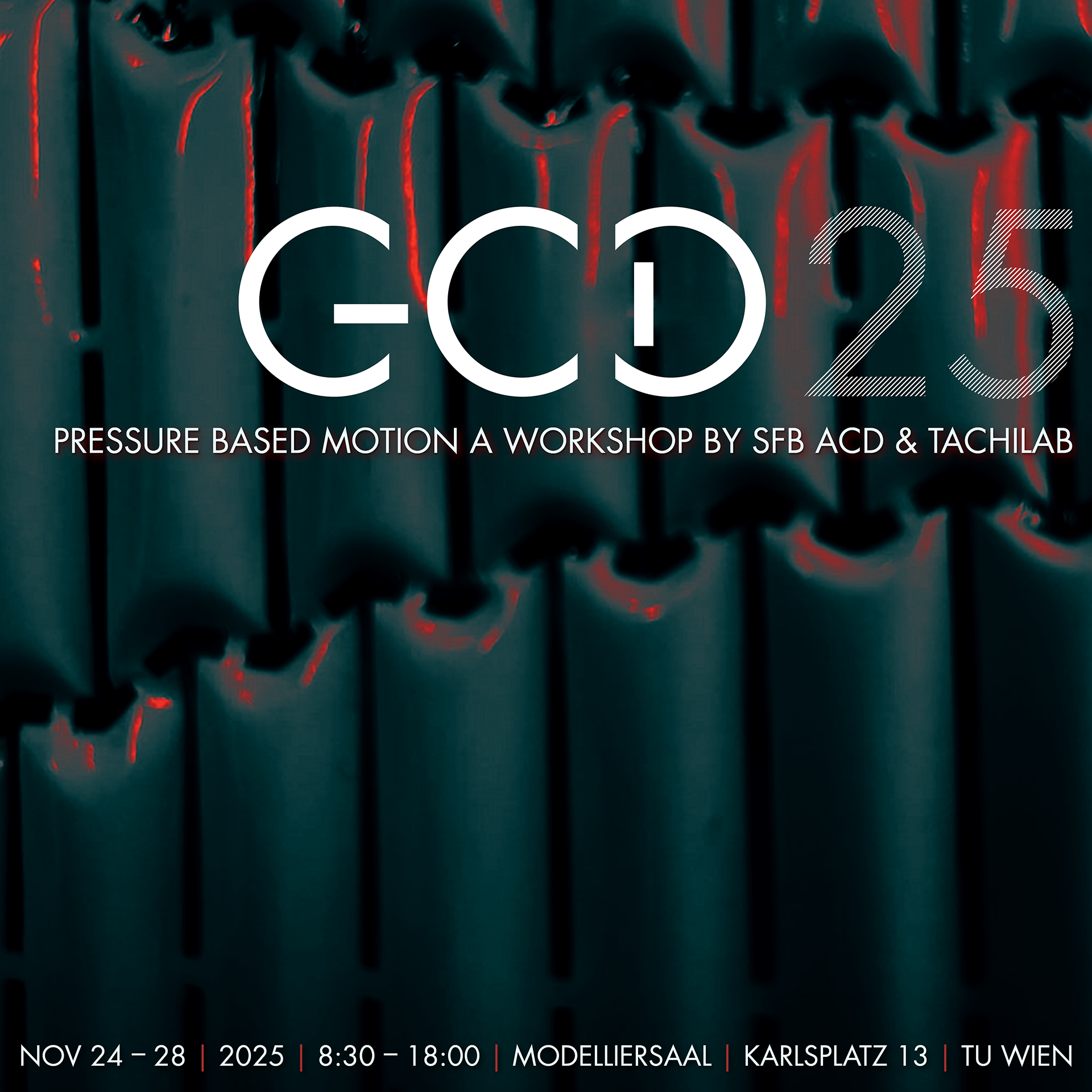
workshop on pressure based motion
workshop on pressure based motion
workshop on pressure based motion
Events
EXC IntCDC, GCD, SFB ACD, TU Wien
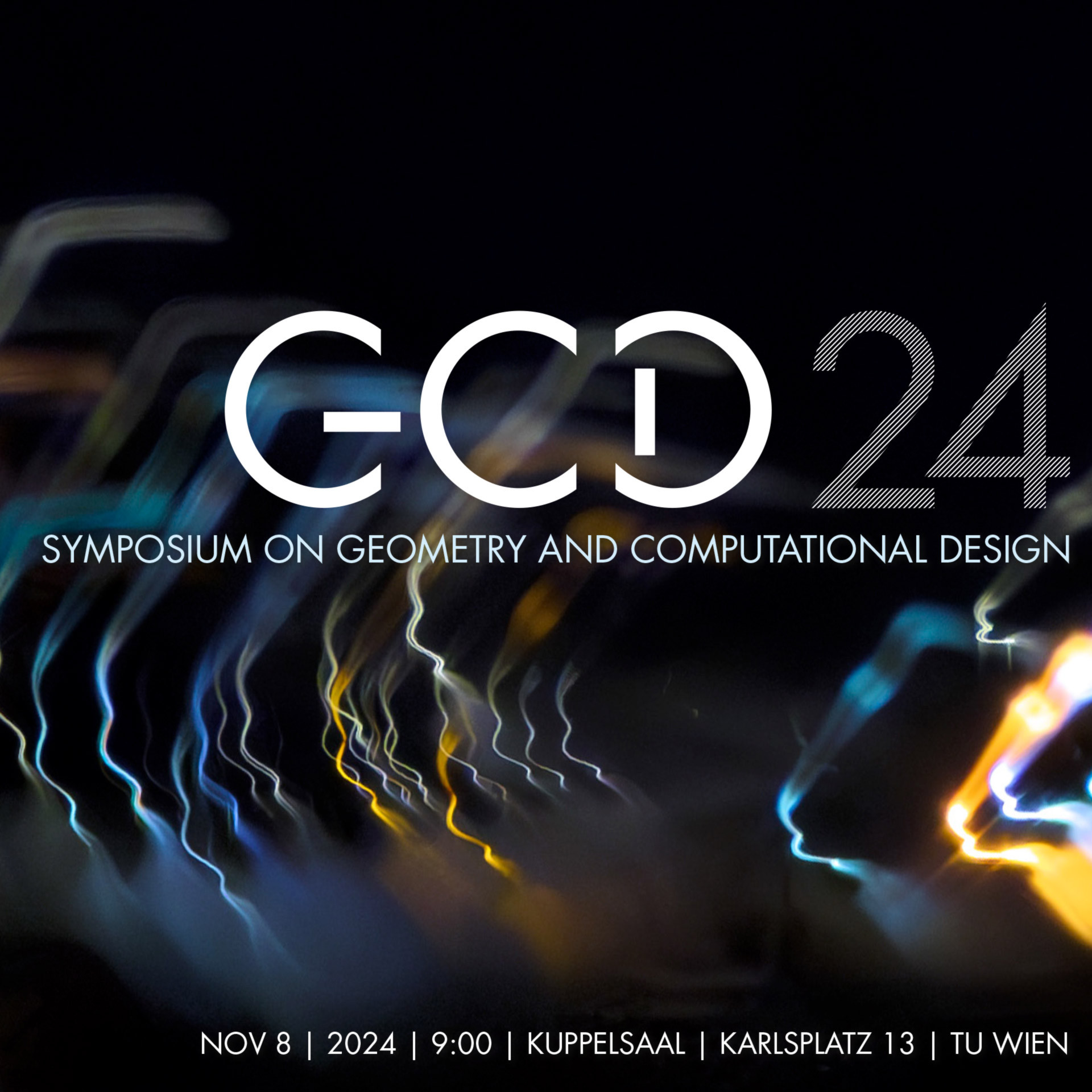
GCD_24 Symposium on 8 November 2024 – Save the date !
GCD_24 Symposium on 8 November 2024 – Save the date !
8 November 2024
Events
SFB ACD
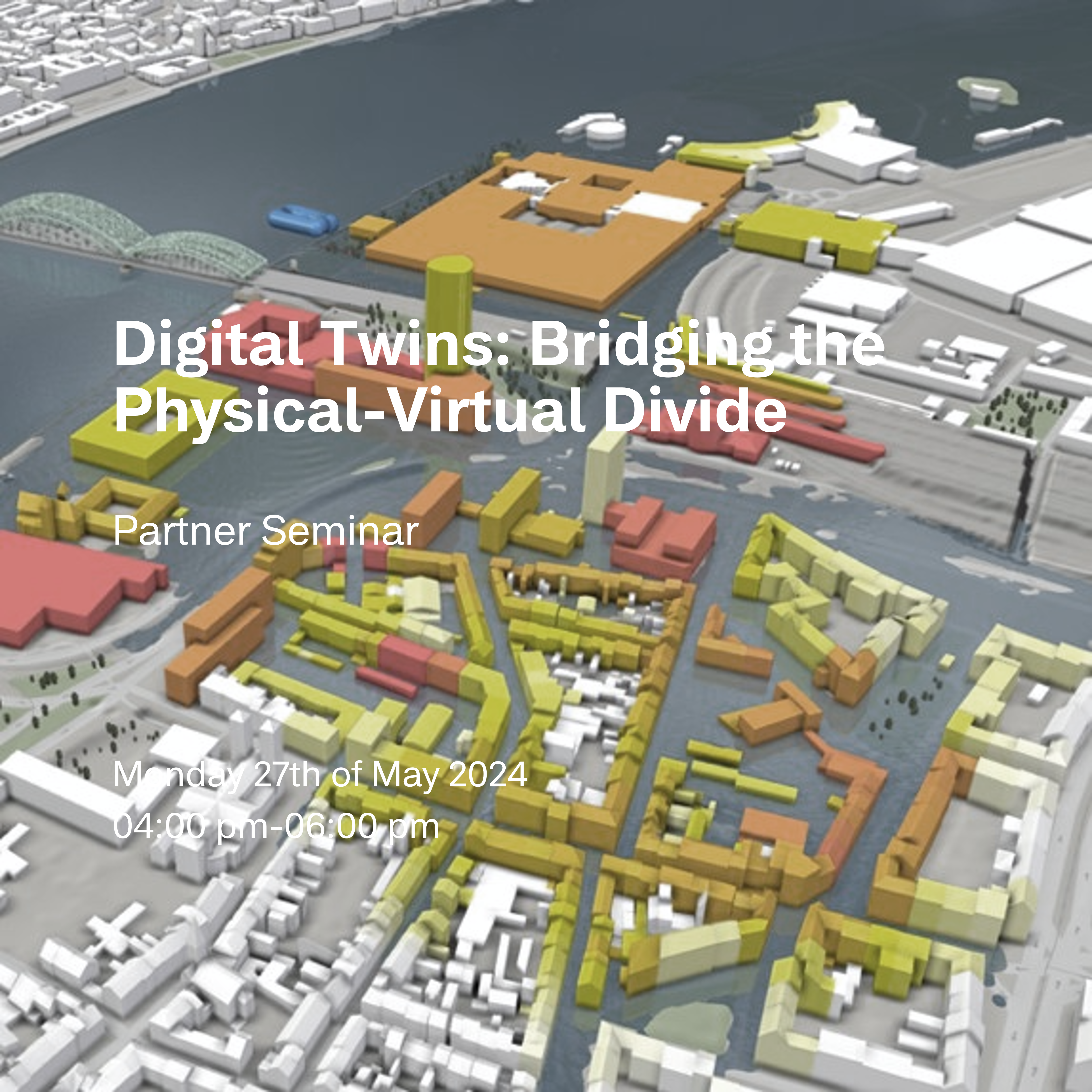
Digital Twins: Bridging the Physical-Virtual Divide / Andreas Walch and Attila Szabo
Digital Twins: Bridging the Physical-Virtual Divide / Andreas Walch and Attila Szabo
may 27, 2024 | 04:00 - 06:00 pm
Events
SFB ACD
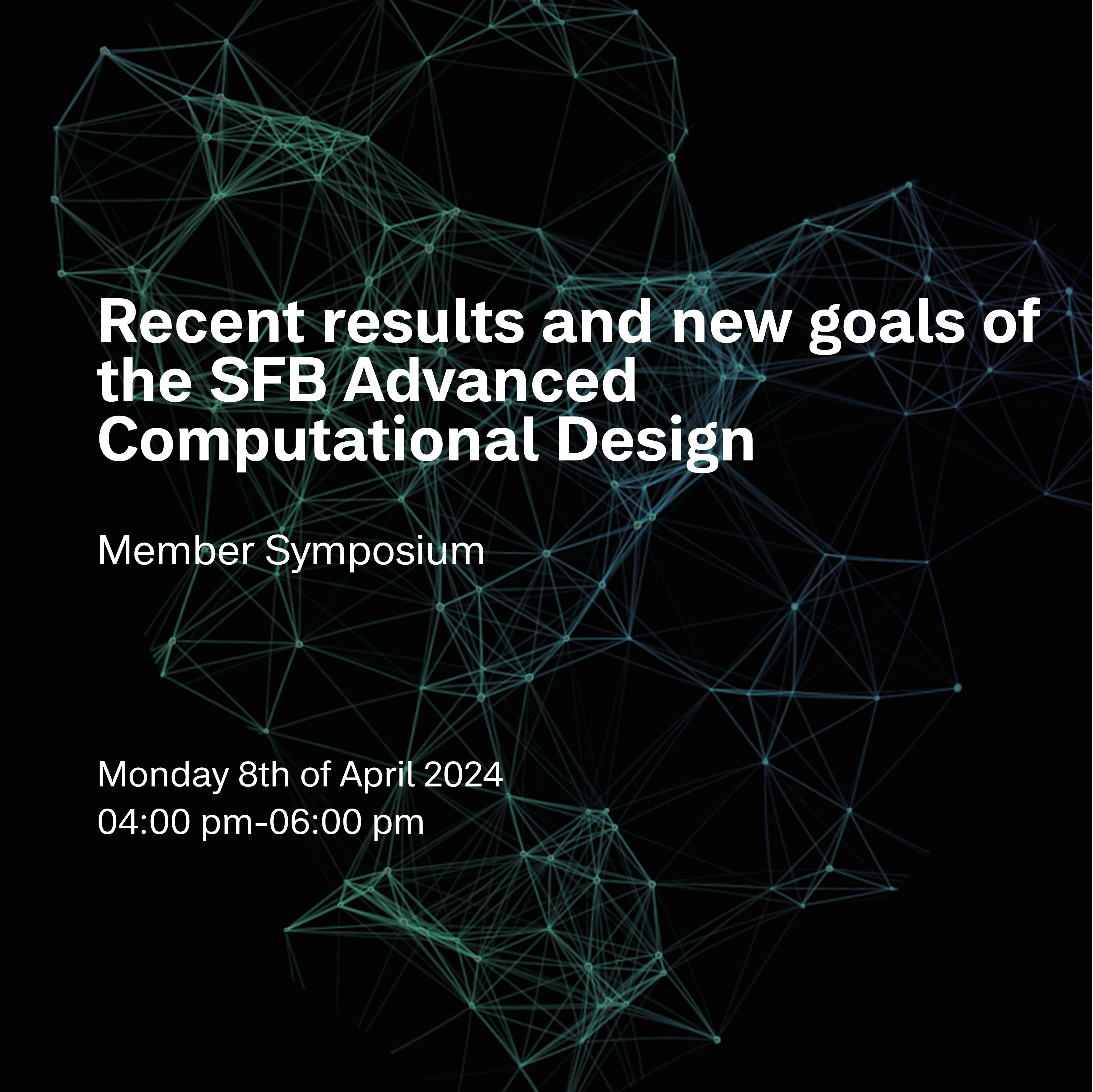
Recent results and new goals of the SFB Advanced Computational Design / SFB ACD Member Symposium
Recent results and new goals of the SFB Advanced Computational Design / SFB ACD Member Symposium
april 8, 2024 | 04:00 - 06:00 pm
Events
SFB ACD
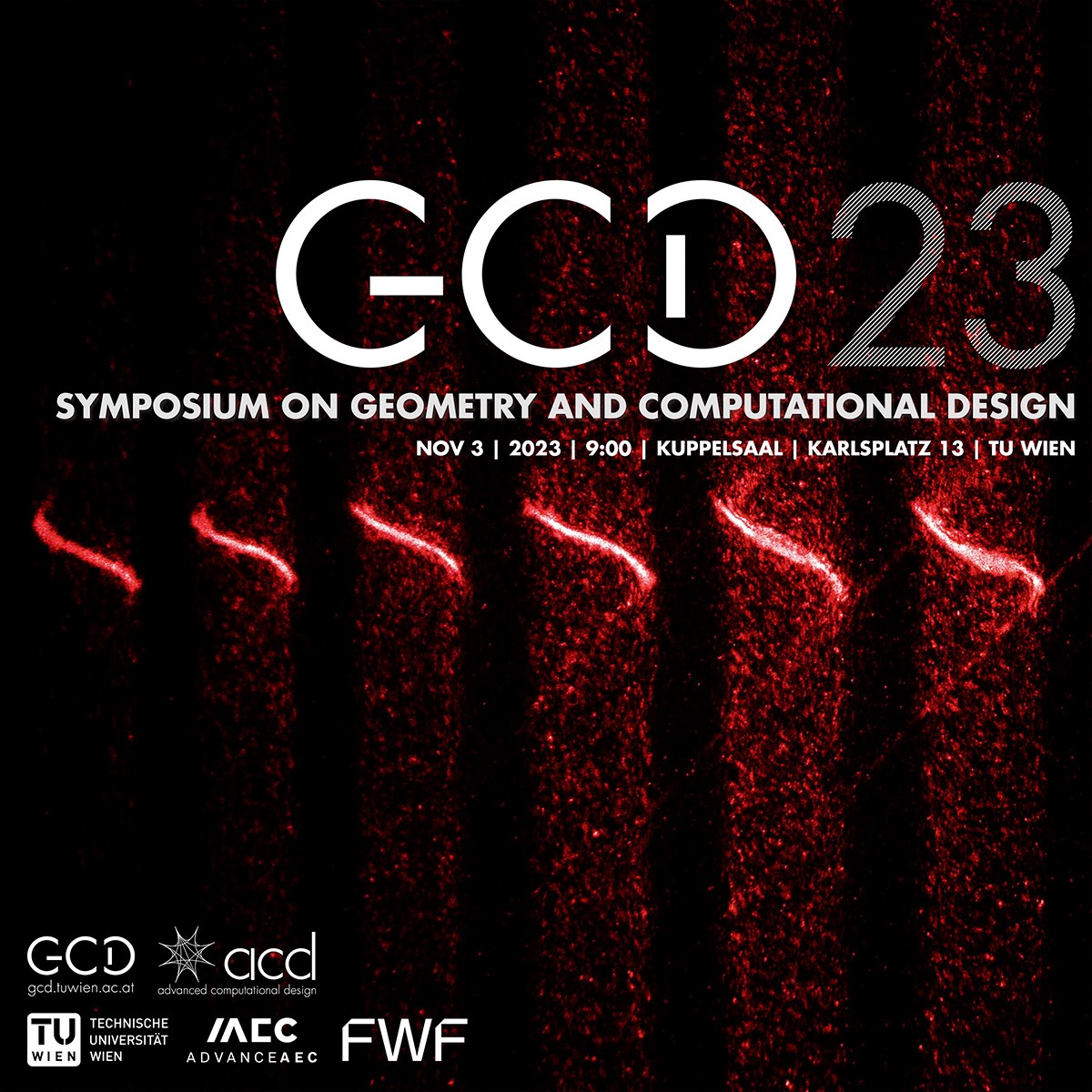
8th Symposium on Geometry and Computational Design
8th Symposium on Geometry and Computational Design
Date: 4-6 APRIL 2024
Events
SFB ACD
aaec Network partner seminar – CANCELLED
aaec Network partner seminar – CANCELLED
Date: Monday, 27th of March 2023

News
SFB ACD
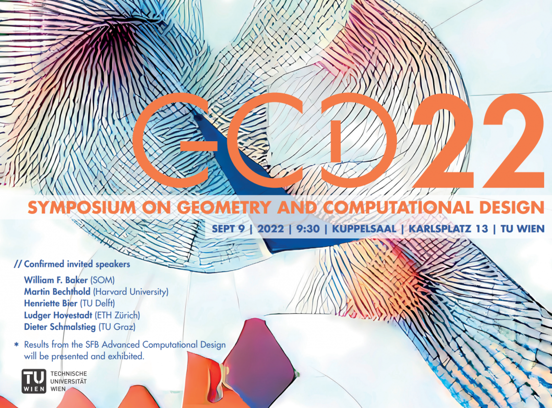
GCD_22
GCD_22
autmns school workshop
SFB ACD
Workshop #3 – From point cloud to materialized point structure. Creation of 3D printed ceramic objects designed via manipulation of 3D pointclouds encoded as 2D images
Events
SFB ACD
SFB ACD advanceAEC network member symposium
SFB ACD advanceAEC network member symposium
Date: 23. May 2022
News
SFB ACD
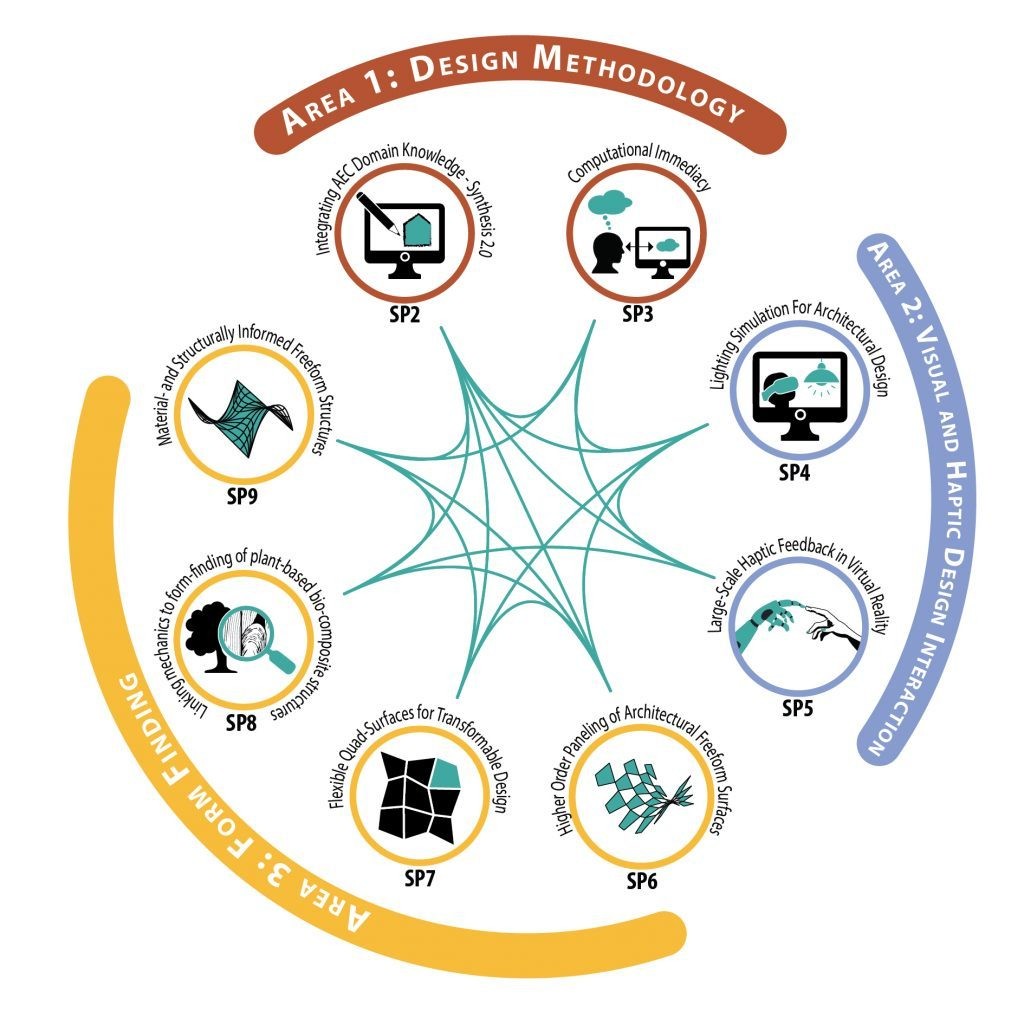
ACD: Advanced Computational Design
ACD: Advanced Computational Design